Responsive design
Building one web page that rearranges itself to fit any screen size.
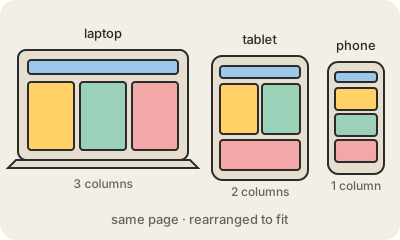
Responsive design is the practice of making a single website that adapts to the screen it is shown on. On a wide monitor a news site might show three columns side by side; on a tablet, two; on a phone, one long column you scroll with your thumb, with a bigger font and a menu tucked behind an icon. Same address, same content, different arrangement.
It works mostly through CSS. Layouts are built with flexible widths (percentages instead of fixed pixels), images that shrink with their container, and media queries: rules like "if the screen is narrower than 600 pixels, stack these boxes". Modern layout tools such as Flexbox and Grid make this much easier than it used to be. Many teams design mobile-first: start with the phone version and add columns as space appears.
The term was coined by Ethan Marcotte in 2010, just as smartphones took off. Before that, companies often built a separate "m." mobile site. Today more than half of web traffic comes from phones, and search engines rank pages partly on how well they work on mobile, so responsive design is simply the default.
Keep in mind
- One site, one URL, a layout that adapts to each screen width.
- Built with flexible grids, scalable images and CSS media queries.
- Mobile-first means designing the small screen first and growing from there.
- Replaced the old practice of separate mobile sites.
Go deeper
- Responsive design (MDN)
- Responsive Web Design, by Ethan Marcotte (A List Apart)
- Responsive web design on Wikipedia